F1 Shift.net
Points Scorer
To put it simply, I hate seeing testing lap times. There are far too many variables and unknowns from testing times, and comparing those times from one team to another is not a viable option. However, there are two pieces of data that can be helpful in making predictions: 1) mileage and 2) mechanical failures. The two biggest factors in Formula 1 will be understanding the tires and mechanical reliability. It is vital for teams to be gathering as much data as possible, while not experiencing too many mechanical woes. So to see how the teams might fare in Australia, I put together a little metric to gauge where the car ended last season compared to where it might be to start the 2013 season. *key word "might".
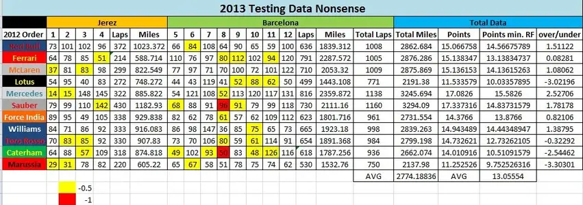
Let's start with the chart. As you can see, we have the laps collected by each team and total mileage ran. We then assigned 1 point for every 190 miles (average F1 race distance) ran, and deducted .5 points for every Red Flag the team caused during testing (for either mechanical trouble, crash, or beaching in sand traps). You will see two different colored boxes on the chart. Yellow represents 1 Red Flag caused and Red represents 2 Red Flags caused during a testing day. So now, let' scroll over to the important stuff, total mileage. The teams averaged 2,774.188 miles gained during testing, so obviously, if you were above that, you most likely had a pretty good test and anything below will be slightly disappointing for the teams. Some highlights here: Sauber with 3,294.09 miles collected and Lotus with only 2,191.38 miles collected.

Now we move to the points. Remember, 1 point for every 190 miles completed with 1/2 points being deducted for each red flag that team caused. The teams averaged 13.05554 (points minus red flag), so again, above that is good, below that is disappointing. The over/under is then determined by taking Points Minus Red Flag - Points. The over/under is then used on a range that is determined by the 2012 standings (see range graphs). As you can see, Red Bull can be expected to move forward 1.5 places from 2012 finishing position, while Lotus takes a massive drop of 3 places from 2012 finishing position and Mercedes makes a huge leap of 2.5 places from 2012 finishing position.

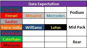
So what does this nonsense tell us? Take a look at the 2013 Data Expectation Range and Data Expectation table. Red Bull should be above the rest of the field by a fairly comfortable margin, easily on the podium with a great chance for victory. Ferrari, McLaren and then surprisingly Mercedes will fight for the rest of the podium while Sauber is sitting on an island between the top teams and mid pack. Force India and Williams could both leap Lotus in the mid-pack with Toro Rosso between the mid pack and rear teams yet again. Again, this is not a sure thing for predicting performance between the cars, but it can give us an idea of what to expect based on the data collection and reliability teams experienced during testing. Will Red Bull really be that far above the rest of the teams? Will Lotus really fall that far? I'm not so sure, but it will be interesting to see if what data tells us is anymore accurate than the testing lap times.
