Site changes over the coming few weeks

or another suggestion, just throwing it out there, but how about, moving the who's online, forum stats, donate and share boxes to the bottom of the page in the gap between the pit lane and the bottom bar, then drop the twitter feed in to the space left by those. That way the page is filled nicely without looking ott. (do you still need a "staff online box" or are the staff name colors now highlighted in the whose online box??) Just some more thoughts.

Edit: we also need a better "sad" smiley because the one we've got never seems to look sad enought :D
 
Already tried that, it looked rubbish :(

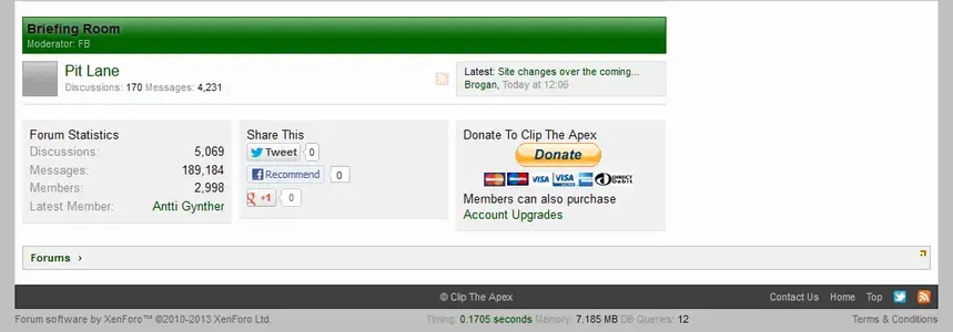
stats.webp

Obviously the styling is a bit off but it just looks completely wrong.

What we need is two sidebars...
 
The only solution I can come up with is to restore the old News page and have all the Twitter feeds on there as before.

The problem with that is as it's not on the "home" page, people just won't bother reading them.
 
I'm happy with just RSS as long as we keep the twitter in chat. The only time I check it is during races and having it in chat saves me having another window open along with the timing screens and driver tracker. I'm assuming the twitter feeds are the ones followed by the cliptheapex account?
 
Can you have a sidebar on both sides of the page? I've always wondered why the majority of web-sites are in a 4:3 (or thereabouts) ratio when the majority of people now use widescreens in a 16:9 or 16:10 ratio, so about a third of the screen is just empty.
 
I'm assuming the twitter feeds are the ones followed by the cliptheapex account?
Not exactly.
There are about 10 different lists and the chat one just contains those accounts which tend to do live race updates.

Can you have a sidebar on both sides of the page? I've always wondered why the majority of web-sites are in a 4:3 (or thereabouts) ratio when the majority of people now use widescreens in a 16:9 or 16:10 ratio, so about a third of the screen is just empty.
The reason for a fixed width is twofold:
1. It allows the layout to be controlled which is required when you're dealing with tables and pages such as the circuit page, also the old home page.
2. Reading from left to right on a widescreen monitor from edge to edge is uncomfortable - you shouldn't have to physically move your head and neck to read. There's a reason why the BBC and other major sites are the same width as here. It's the same reason why newspapers write in columns, rather from edge to edge.

The actual width chosen is due to the number of 1024 resolution monitors which still exist - I would have preferred to have gone up to 1200 or so but a poll on it showed that some were still using 1024.

Unfortunately 1000px is a bit too narrow for three columns, with a sidebar either side.

At this point in time I'm stumped.
The various ideas I had just didn't work for one reason or another :(

This was one of them suggested by Mike...
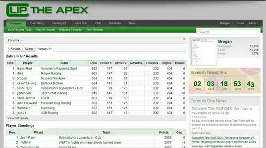
tabs.webp

But problems with the code prevented that.
 
do you still need a "staff online box"
I had already moved the staff block below the members online block to make it less prominent, but you're right, it's something i have been considering for a while so it has now been removed.
The current staff can be seen on the Help page, plus there's the green panel below the avatars in posts.

The PayPal block has also been removed - it never gets used anyway so was just taking up valuable space.
It was intended for the many data miners we get who harvest the overtaking data but not a single one has ever contributed.

Edit: The Share Page block has also been removed - in 5 years there have been 0 Tweets, 37 Facebook recommends and 4 Google+ so it's not worth keeping.
 
The Chat page now has a new Twitter widget: http://cliptheapex.com/chat/

Apparently the old one more or less died last May and I had no idea...

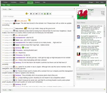
Anyway, this is what it used to look like:
twitter-old.webp
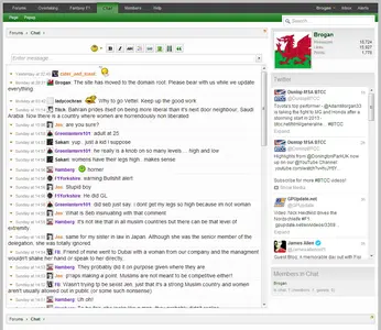
This is how it looks now:
twitter-new.webp

I shall add one to the forum page also and then work on updating the two lists to make them more useful and relevant.
 
The Twitter lists have been updated.
I have tried to keep them fairly relevant and free of the usual spammy crap which is all too prevalent on Twitter.

So currently the two feeds follow these accounts:

Forum
AUTOSPORT ‏@autosportnewsf1
Ted Kravitz ‏ @tedkravitz
Planet F1 ‏ @Planet_F1
Formula1.com ‏ @Formula1
Andrew Benson ‏ @andrewbensonf1
Craig Scarborough ‏ @ScarbsF1
James Allen ‏ @Jamesallenonf1
Sky Sports F1 ‏ @SkySportsF1
FIA Press Releases ‏ @FIAPressRelease

Chat
Le MansLive Michelin ‏ @LeMansLive
BBC5LiveF1 ‏ @BBC5LiveF1
F1 Fanatic Live ‏ @f1fanaticlive
AUTOSPORT Live ‏ @autosportlive
Dunlop MSA BTCC ‏ @DunlopBTCC
James Allen ‏ @Jamesallenonf1
GPUpdate.net ‏ @GPUpdate
BTCC Crazy Live ‏ @BTCCCrazyLive

Feel free to suggest any others you may think are a good fit - specifically F1 news for the forum feed and live race updates for the chat feed.
 
Do any of the teams have Twitter feeds? Suppose to cover them all would take up too much space and to only cover some might be a teeny bit divisive...
 
Yes, they all have them but 90% of the tweets are crap so the signal to noise ratio would be too low.

There wouldn't be separate blocks added, everything would be in the same feed.
 
@f1kate. She usually has a lot of the gossip and rumours before it becomes actual fact. Apart from that you have it all pretty much covered if you're not doing individual teams.
 
@F1enigma is my favourite for reliable information, may be worth adding. He is to the inside workings and wheeler dealings what Scarbs is to the technical side.
 
Just checked F1Kate and it seems to be mostly crap with the odd decent tweet.
I have added F1Enigma though - good call on that.
 
Back
Top Bottom