Site changes over the coming few weeks

News feed for me. More relevant, a lot tidier than all that "hash tag" nonsense and an overall smarter appearance. (plus I can't remember the last time I logged into twitter).
 
Then twitter feeds are useful as it saves me logging into twitter. I'm always clicking on the links on the right of the page while waiting for more interesting forum content to pop up.

Edit.

Is it the news feeds that are on there now? That is just as useful as the twitter although I would miss the gpupdate links as they usually provide a lot of humour.
 
Currently the RSS feed is showing.

cider_and_toast, you don't need to be logged in to Twitter to be able to click on the links to articles from the feed.
That's all I ever do.

F1Yorkshire, I can bring the Twitter feed back elsewhere, I'm just trying to work out which is the more useful in the sidebar.

I'm kind of leaning towards the RSS feed at the moment as it's more of a pure news feed and also the Twitter feed fails quite frequently due to high load, which results in a blank panel for long periods.
 
Twitter would be more useful in the chat page if possible. The live updates from the teams and news agencies are most relevant during races.
 
There is already a Twitter feed in the chat page, but the list is mainly live updates.

Further to my comments above, the drawback with the RSS feed is it's updated much less frequently, but at the same time it's not full of pointless rubbish, which the Twitter feed can be.
 
Thanks to Mike's genius, the changes are actually going to be considerably better than I had planned.

I think they should actually please everyone, if that is possible...
Sadly my cunning plan has encountered several flaws so it's back to the drawing board.

:(
 
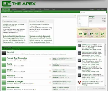
How about something like this?

Essentially have the RSS feed above the node list and the Twitter feed in the sidebar.

Ignore the layout and blank space on the right, I haven't yet decided what it will look like exactly.

mock-up.webp
 
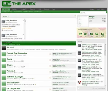
Or of course we could do the opposite and have the RSS feed in the sidebar and some Twitter blocks above the node list, although that looked a bit messy when I tried it.

I'll do another mock up.

mock-up2.webp
 
Not that it matters but, I don't use twitter and I don't like twitter, but having it on the site wouldn't change my experience of this site one way or the other...
 
I like the news. Might grow to like the Twitter, but quality much more variable. Depends on who is followed :)
 
Twitter definitely has a much lower signal to noise ratio.

I have been experimenting for days now with various layouts but the RSS and Twitter feeds are really meant to be longer than they are wider so the only place they work is in the sidebar.

Unfortunately having them both there just results in a massively long sidebar.

I may just leave the RSS news feed in place as I can't see a solution :(
 
Erm, not sure if this would work or not, but can you have the two feeds in the same spot and a button on top of the feed that lets the user toggle between the two ??
 
Back
Top Bottom