New design

Brogan

Legend
Staff Member
The current design (logo, colour scheme, etc.) was thrown together in a bit of hurry when we switched to the new software.
There was so much work to do that other than a few colour changes and minor tweaks, it was largely left the same as the default style: http://xenforo.com/community/

As you can see anyway, design isn't my strong point :D

Sometime this year we would like to revamp the whole design so if there are any designers here who would be willing to work with us, please get in touch.
 
Brogan, I may have some designers with spare capacity, same with any technical roles you may need, just give me a shout with what you are after and I will see if anyone wants to do the boss a favour ;)
 
I've made a provisional start on the new design process.

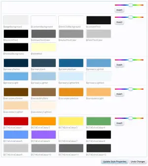
The first stage was to create an add-on to extend the default colour palette, providing more flexibility. You can see that in the additional 12 colours at the bottom of the screenshot below.
palette.webp

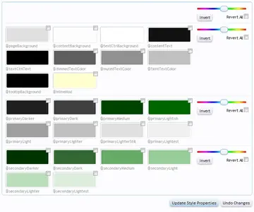
For reference, this is the current palette:
palette-current.webp

The next step will be to actually define all the individual colours in the palette.
 
The whole site is now using Arial, which is the same font we've been using as the message font since the start.

I know Arial is a little unadventurous, but it is one of the narrowest fonts, and as we have a fixed width style (designed to fit on 1024 screens), we need as much horizontal space as we can get.
Oh and it's predictable - it's 100% certain that every single device, OS and browser has it installed.

This is the beginning of the new style - it's going to go back somewhat to what we had on the old software; lots of clean edges, possibly orange and grey again, not sure yet...
 
Yup, slowly getting rid of most (if not all) of the border radius.

I was going to work on the design on a separate test site and change it all at once, but it's a massive job so I figured I'd just do it bit by bit on the live site.

Once the basic structure is in place we can start looking at the new design/colours, etc.
 
I think that's all of the border radius eliminated now.

A virtual prize to anyone who spots any remaining rounded corners (other than for the social network icons, etc.).
 
By using "etc" you've negated any opportunity for any to be spotted. I'm virtually annoyed that there will be no virtual prizewinning.
 
That must be a browser bug/issue then as it appears fine in Chrome, FF and IE.

There's not much I can do if it doesn't display correctly in iOS browsers.
 
That's weird. I know browsers apply local formatting to some form elements but I've never come across iOS rounding text input fields. Are you sure it's not in some browser specific CSS?
 
There's no browser specific CSS for the search panel at all.
Just a few simple border-radius declarations which have now been removed.

Unfortunately I don't have any Mac or mobile devices so testing is not an option.

I actually have no idea how the site looks (or renders) on anything other than a PC.
 
Back
Top Bottom