Pre-Season 2015 Car Launches

B8hChxpCQAEt24n.jpg
 
Either get rid of that red paint or get some more on it somewhere else. It just looks daft. (I know that that will have absolutely no effect on the speed of the car but...)
 
It looks pretty skinny and slim, apart from the chunky looking air intake. The rear end in particular looks a lot tighter than what I remember previous McLaren's looking like.

I think the red stripe looks bad in the top photo above because you can't see it continue down the back of the car from that angle, plus it doesn't surprise me that the orange rumours have proved wrong again. Still a complete lack of sponsors, though.
 
Erm, it's a no from me.

Not that the paint job ammounts to a hill of beans in the over all scheme of things as long as the car is quick but it is part of the teams identity on track. I would rate it as f'ugly.

Why retain the silver ?? could it be that a move away from what has been the core McLaren colour scheme for almost 20 years would be too much to soon? The red looks hugely out of place and the black patch just looks dull.

As I said though, the real story will be how quick it goes on the track.
 
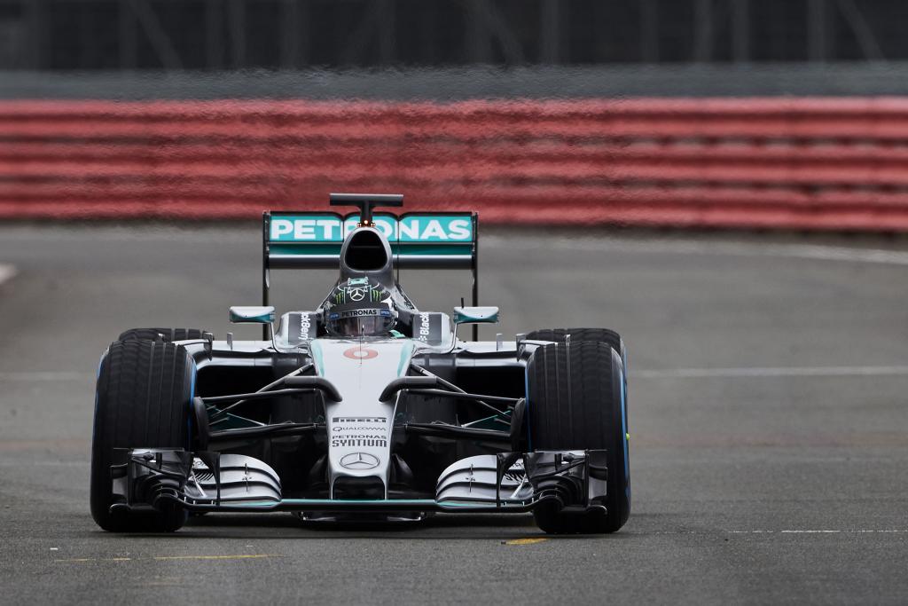
From the front on view it looks like the front lower wish bones are becoming more like additional front wings. I hate the 'tache style nose 'sticky out bits'. Also, it's the usual huge pre-testing, how small can we actually make these before the start of the season, brake ducts.

Over all, much better looking shape than last year.

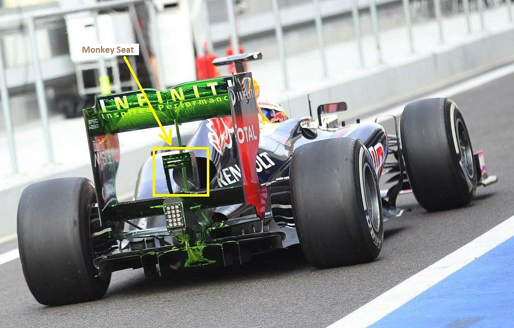
I can't remember if last years car sloped down quite so dramatically at the back of the side pods. It seems like the front edge of teh upper rear wish bone is a lot more exposed?
 
Thankyou. :thumbsup:

Now please everyone, tell me I wasn't the only one who had no idea that's what that part was called?
 
Back
Top Bottom