I have to admit, while grocery shopping, I wondered why Red Bull and Toro Rosso don't use different Red Bull packaging colors to make them more visually distinct from each other. For sure, there were three different colors of cans on the shelf when I looked, not just two - Red Bull, Red Bull Light, and Red Bull Zero. The most visually distinct, at a glance, were regular Red Bull, and Red Bull Zero, one's deep blue and silver, the other's this super pale blue and silver. Oh well. I'm just an artist, not a pro livery designer/paint guy for the Red Bull teams. But maybe I'll have a play in Photoshop and make my own RB and TR liveries just to show how just changing which packaging color they use makes them very visually different.
But maybe I'll have a play in Photoshop and make my own RB and TR liveries just to show how just changing which packaging color they use makes them very visually different.
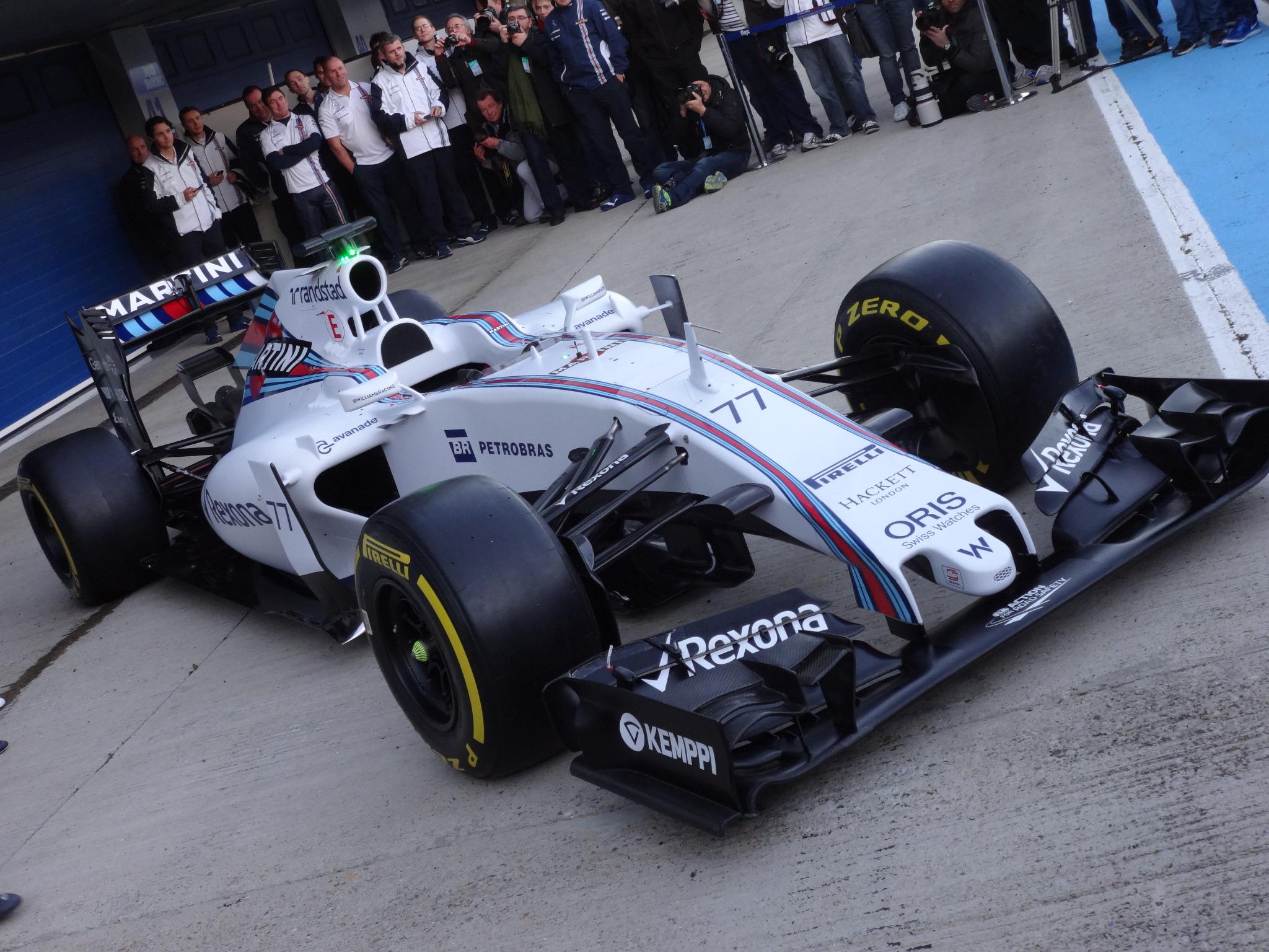
Toro Rosso looks rather glorious except for the whole livery thing. Definitely would be unique if Red Bull kept that, I wouldn't mind. They definitely won't though. I really love these cars, a wide variety of looks but they all look really nice. Some liveries could use work but no more step noses or penis noses to complain about they actually got the low noses right this time.
This site uses cookies to help personalise content, tailor your experience and to keep you logged in if you register.
By continuing to use this site, you are consenting to our use of cookies.

 Oh well. I'm just an artist, not a pro livery designer/paint guy for the Red Bull teams. But maybe I'll have a play in Photoshop and make my own RB and TR liveries just to show how just changing which packaging color they use makes them very visually different.