Have your say on the future site design

Brogan

Legend
Staff Member
The new site design has been in place for several months now, more than enough time for most people to evaluate it.

We will be working on some updates over the winter and this is your chance to tell us what it is you do and don't like about the site.

Whether it's the colour scheme, the page width, layout of a specific page, functionality of a particular item, or even something that you feel is missing and should be added, etc.
No matter how small or big, we want to hear about it.

Also, if there are any bugs or problems you've noticed, again please say.
When reporting problems, please list your operating system and brower as well as the versions; e.g. Windows XP, Firefox 3.0.13

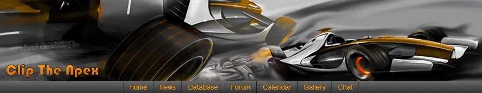
So we're looking for feedback on the following pages:
  • Home
  • News
  • Database
  • Forum
  • Calendar
  • Gallery
  • Chat

If you have any ideas or suggestions for new pages, sections, content, etc. please post them.

We already have some things planned but we don't want to to give anything away at this time so don't be offended if we don't respond to your feedback.

Don't be afraid to speak up, now's your chance to (possibly :D ) influence the future design of the site.
 
The only possible critique I could have is that to external eyes the colour scheme could look a little - McLaren. And why's the top banner got grooved tyres?
 
Thanks TBY.

The colour scheme was intentional, I actually researched the official McLaren orange and based the design on that.
For several reasons really but mainly because most F1 sites tend to be red so it was something a bit different.
It was either that or green and Gav threatened to stop all work if we went with green :D ;)

As for the banner image, that came from some orginal artwork by Adrian Dewey of Auto Concept.
I like to think of them as wet weather tyres ;)
 
Any more feedback?

We're going to be starting on the work soon so we really need your suggestions before it's too late to incorporate them.
 
I have no idea whether thei is possible, but can you get the menu bar to be part of a pane so it does not scroll off the top of the screen?

Otherwise I tend to be happy me :twisted:
 
Thanks Geoff.

Do you mean so the banner and the grey menu buttons at the top (Home, News, Database, etc.) are permanently fixed at the top of the screen?
The bit in the image below?

I'll look into it but it might be a bit tricky to implement.
It could also cause problems for people with smaller screens so I need to check that too.

Thanks for the feedback :thumbsup:

TBY, behave :clip:
 

Attachments

  • banner.png
    banner.png
    186.6 KB · Views: 161
Bro,

Yup, that was what I was wondering.

I honestly wasn't sure if it was possible or not though.

I guess two other variations on a theme could be:

- put the menu bar above the banner and only lock the menu, or
- repeat the menu bar at the bottom of the screen.
 
I'll see what I can do about that.

It might be a bit tricky as it's linked to ranks which are linked to post count so I might have to do a bit of hacking.
 
TBY, can you let me know what ranks/images you were after?
Is it just for the annual Fantasy League or also the Fantasy F1 Cup?

Not sure we need them for the Caption Comp's or FitB otherwise eventually everyone would end up with one.
 
I love everything..............

Except the bookmark link on every post, I know the pop up time has been changed but it just gets right on my :censored:

I've never used it and usually if I want to bookmark something I do so within my browser, other than that :thumbsup:
 
Speshal said:
Except the bookmark link on every post, I know the pop up time has been changed but it just gets right on my :censored:
Point taken, I'll increase the pop up delay again :D
That way it should only pop up if you hover over it for a second or more or unless you click it.

I've never used it and usually if I want to bookmark something I do so within my browser, other than that :thumbsup:
Actually it's not for bookmarking the post, it's for sending it to any of the social networking sites such as Twitter, Facebook, etc.
Or do you mean you have an AddThis add on in Firefox?

Edit: Just for you Spesh I've increased the delay three fold so now it takes over 1.5 seconds to pop up. Let me know if you still have problems.
 
Very much a current complaint, but can your Featured Article not appear elsewhere on the home page. Duplicates aren't a great idea!
 
teabagyokel said:
Very much a current complaint, but can your Featured Article not appear elsewhere on the home page. Duplicates aren't a great idea!
That's a quick fix by editing the proc'.
I'll have to ask Gav nicely... :D

Or you could just quickly post 2 new threads ;)
 
One thing that has just occured to me is perhaps there could be an area for "Classic" motorsport discussion. A lot of topics we talk about would be better suited to a historic area which would leave the the F1 forum for the current stuff. I know we've got the gravel trap but that's better for the anything goes fun stuff.

Just a thought any way.

I'd drop the "track days" one as it hasn't seen much take up perhaps merge the remaining motorsport forums (bikes etc) into a general motorsport discussion area. Keep F1 and BTCC seperate though as they generate some discussion.

I reckon it should be:

F1
BTCC
General Motorsport
Motorsport History
 
Back
Top Bottom