Upgrade to XenForo 1.2

Brogan

Legend
Staff Member
There has been a beta release of the new version of the core software we use, XenForo.

As a result, I have started making various changes necessary for the upgrade.

The first of those is there are now two styles: Fixed and Fluid.
Click on the link in the very bottom left of the footer to switch between the two (it should say Fixed currently).

As the names suggest, one is a fixed width, the other is a fluid width, which will eventually become responsive when we upgrade.

The Fluid style will be the default in the future, so any new members or guests will automatically receive that style.
Members can of course choose which style to use permanently when logged in.

Currently there is no responsive element to the style, it will just shrink to fit smaller windows but feel free to use it in the meantime.
Bear in mind though that it has not been optimised for narrow width screens so won't work well in some cases.
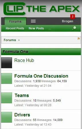
 
Had a quick play using the fluid setting on my phone. It seems a lot more responsive when it comes to automatic re-sizing so can definitely say job done!
 
The BB Code buttons on the chat page and pop-up have been disabled as they are not compatible with 1.2.

I don't think they were really used that much anyway but when chat has been updated they will probably return.
 
Sadly it looks like the Google table and chart API which is used for the Race Hub no longer works with 1.2.

Unfortunately that may mean the end of the Race Hub pages as there's no easy way for me to replicate the content without the API.
 
A considerable amount of work has been done and the upgrade plan is taking shape.

There still remains some work to be done with the style, due to the changes in the code.
That is probably going to be the longest part of the process, especially when it comes to the responsive elements, which is turning out to be a massive pain (I knew there was a good reason why I hated it and never wanted to implement it).
 
The responsive style is coming along.
Rather than have two different logos which would change using media queries, I have reduced the size of the logo.

The minimum width the site can go to without scroll bars now is 286px.
Which means it should work on the smallest of devices.

Here are some screenshots.

responsive-1.webpresponsive-2.webpresponsive-3.webp
 
The software is now at an advanced beta stage so the final upgrade plan will be worked on this week.

All being well, I hope to get the site upgraded within the next few weeks, but this depends on finding the time to do it as there is still a lot to do, mainly with the style and the responsive elements.
 
The site is now running 1.2.

The default style is now responsive, so it will automatically resize to the browser width.
If you would prefer to use the original fixed width style, click on "Fluid" in the bottom left hand corner of the footer and select "Fixed".

The rich text editor should now work with all devices, including Apple.

There are some new features as mentioned here: http://cliptheapex.com/threads/xenforo-1-2-new-features-and-functionality.6239/

If you notice any problems, issues or bugs, please post in this thread.
 
I see smileys and other bits on my iPhone! Although with the new phone style I can no longer see which thread was the last to be updated in a certain sub-forum. Was this to be expected with the change?

Also when the phone is rotated to landscape mode the sidebar with the next GP information and feeds appears at the bottom of the list and not to the side.
 
Last edited:
Unfortunately some stuff has to be dropped at lower screen widths and that is one of them.

You can always switch back to the fixed width but those are the only choices - I have no control over which bits are removed/retained at the various width trigger points.
 
Last edited:
Can't have everything but the increased visibility makes the site easier to read on the smaller devices. Are ipads and tablets affected in the same way?
 
I'm wondering if this will solve my problems with the system at work ?? Hmmmm. Something to look forward to when my bum hits the chair in the office tomorrow.

Happy that the "recent threads" button is back as it was far easier to keep track of what had been replied to and what hadn't than using the new threads button where once you'd read the info it fell off the page.
 
Every browser on any device.

You can resize the browser on your desktop PC to see it dynamically resize each page and watch bits disappear.
 
Every browser on any device.

You can resize the browser on your desktop PC to see it dynamically resize each page and watch bits disappear.

ooooh fancy! So those users with a tablet should have all information unless they have a really mini one. Nice to see some missed features come back and being able to see that a post has been edited is useful too.
 
I should point out that some pages aren't responsive due to the nature of the content.

The Race Hub pages and the archived Fantasy F1 pages.
The Overtaking Database index and the individual GP pages.
The Fantasy F1 application (when I get around to adding the no responsive variable).
 
Back
Top Bottom